
There is a particular shade of ivory that I have been searching for, on and off, for nearly seven years. It is not white. White is too sharp, too clinical, too demanding of flawless lighting and pristine surroundings. This ivory is warmer — the color of heavy cream before it becomes butter, the color of old paper, the color of a shell I found once on a beach in Maine and kept in my coat pocket until it crumbled. It is the kind of color that does not announce itself. It simply waits, quietly, to be noticed.
I found it, finally, in a cashmere sweater two winters ago. I was not looking for it. I had stopped actively searching for this particular ivory several years earlier, accepting that it might exist only in my memory of that Maine shell. But there it was, folded on a wooden shelf in a small shop in SoHo, and I knew it immediately — the way you recognize a face from a dream, without being able to explain how.

I tell this story because it contains something I believe about neutral colors that the conventional fashion wisdom often misses. Neutrals are not a compromise. They are not what you settle for when you lack the courage to wear color. They are not boring, unless you choose boring neutrals. The right neutrals — the specific shades that resonate with your particular skin, your particular life, your particular way of moving through the world — are among the most beautiful things you can wear. The wrong neutrals, worn thoughtlessly, are indeed flat and lifeless. But the difference between the two is knowable, learnable, and entirely within your control.
What I Mean by a Neutral, and What I Do Not
Before I go further, I want to define my terms, because the word neutral has been stretched thin by the fashion industry. At its most literal, a neutral is a color that does not compete — a shade that sits back, that allows other colors to speak, that provides a quiet ground for a louder figure. Black, white, grey, beige, navy. These are the traditional neutrals, and they have their place.
But I want to expand the definition slightly, and I want to do it in a way that serves the woman who is building a calm wardrobe. For my purposes, a neutral is any color that can function as a background — not just against other colors, but against a life. It is a color that does not demand attention, that does not date itself to a particular season or trend, that can be worn repeatedly without feeling repetitive, and that can be combined freely with most other things in your closet.
Under this definition, a deep olive green can be a neutral. A dusty rose can be a neutral. A faded indigo can be a neutral. The question is not where the color sits on a traditional color wheel. The question is how it behaves in your wardrobe, and whether it brings you calm or demands energy you do not have.
Why the Wrong Neutral Is Worse Than a Loud Color
I learned this lesson in a fitting room during my early years at Vogue. I was trying on a grey sweater — a simple crewneck, theoretically perfect, the kind of piece that should anchor a wardrobe effortlessly. But when I looked in the mirror, something was wrong. My face looked drained. My skin looked sallow. I looked, somehow, less like myself than I had before I put the sweater on.
The grey was wrong. Not grey as a category — grey is one of my most-worn colors — but that specific grey, which had a cool, blue undertone that fought against the warm undertones of my skin. The sweater was a neutral, and it was an excellent sweater, but it was not my neutral.
Wearing it made me feel slightly off, slightly tired, slightly less present. Over the course of a day, that slight wrongness accumulates. It becomes a quiet drag on your sense of yourself.
The right neutral has the opposite effect. It makes your skin look alive. It makes your eyes look clearer. It makes you look rested, even when you are not. It works with the colors you already own. It disappears into the background of your appearance, so that you — your face, your expression, your presence — come forward.
The Neutrals I Trust, and Why
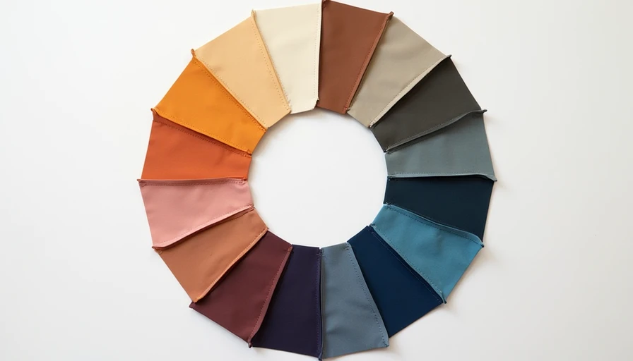
What follows are the specific neutral shades that form the foundation of my wardrobe. I describe them not as prescriptions — your skin tone, your preferences, and your life may call for different shades — but as illustrations of how to think about color, how to evaluate it against your own body, and how to build a palette that feels calm rather than boring.
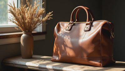
Warm Ivory and Cream. Warm ivory is the most useful neutral I own. It is softer than optic white, which can feel stark and clinical against most skin tones, and it has a richness that reads as considered rather than accidental. I wear it close to my face — in sweaters, in blouses, in silk shells — where it reflects light upward and softens the shadows that exhaustion leaves under the eyes. If you are unsure where to start with neutrals, start here. An ivory silk shirt is perhaps the most versatile garment in a calm wardrobe. It works with every other neutral. It works with jeans. It works under blazers. It works for evening, when the light is low and you want something that catches the candle glow.

Warm Camel and Toffee. I hesitated for years before wearing camel near my face. I feared it would wash me out, or look like I was trying too hard to look expensive. What I learned is that the right camel — a camel with warm, yellow-gold undertones rather than cool, ashy ones — brings warmth to the complexion in a way that feels almost like sunlight. I wear a camel coat in winter, and I wear a camel cashmere crewneck that I reach for more often than any grey sweater I have ever owned. The color works best when it is allowed to be the statement — camel coat over ivory and charcoal, camel sweater with cream trousers — rather than competing with other warm tones.
Oatmeal and Warm Beige. This is the color of raw linen, of unbleached cotton, of porridge and winter mornings. It is softer than camel, more casual than ivory, and it brings a particular texture to a neutral wardrobe that prevents the palette from feeling too polished. I wear oatmeal in knitwear mostly — a heavy Irish cable-knit, a fine merino crewneck — because the color carries texture beautifully. In flat weaves it can look washed out, but in a three-dimensional knit it comes alive.
Dove Grey. Grey is the neutral most likely to go wrong, and I have worn every possible wrong grey: greys that leaned purple, greys that leaned blue, greys so pale they looked like dirty white, greys so dark they read as black in certain light. The grey I trust is dove grey — a medium-light grey with warm undertones, the color of a pigeon's wing or a morning sky before the sun burns through. Warm dove grey flatters more skin tones than cool grey, and it works seamlessly with camel, ivory, navy, and charcoal. I wear it in trousers, in sweaters, in a wool blazer that has become one of the anchors of my wardrobe.
Charcoal. Charcoal is what I wear instead of black on the days when black feels too severe. It is dark enough to provide contrast but soft enough to avoid the starkness that black can bring to a face that is already tired. I wear charcoal trousers more often than black ones. I wear a charcoal wool coat that has outlasted three black coats I bought and discarded. Charcoal works with every other neutral in my wardrobe, and it has a depth that black, for all its elegance, sometimes lacks.
Deep Navy. Navy is the color I trust when I need to feel authoritative but not armored. It is serious, but it is not severe. It is dark enough to read as formal in professional environments, but it has a softness that black does not. My most-worn blazer is navy. My most-worn trousers are navy. In summer, I wear a navy linen shirt that goes with everything I own. Navy also has the advantage of being universally flattering — it makes the whites of the eyes look brighter and the skin look healthier, which is why it has been a staple of portrait photography for as long as portrait photography has existed.
Sage Green and Muted Olive. These are the colors that stretch the definition of neutral into what I think of as living neutrals — colors drawn from the natural world that function as backgrounds but bring more life to an outfit than beige or grey alone can offer. Sage green is the color of certain leaves in early spring, a greyed green that reads as calm rather than energetic. I wear a sage linen dress in summer and a sage merino sweater in winter. Muted olive is deeper and earthier, and it works beautifully as a trouser color or a coat color. These greens pair effortlessly with ivory, camel, navy, and charcoal.
Faded Indigo and Soft Chambray Blue. A faded blue chambray shirt is, in my wardrobe, as foundational as an ivory silk shell. It bridges the gap between neutral and color, providing just enough life to keep an outfit from feeling monotonous while remaining quiet enough to work with nearly everything. I also wear a deep indigo — the color of well-worn raw denim — in trousers and a cotton skirt. Indigo is, in practical terms, a neutral in most wardrobes already. I am simply making the case that it deserves the same intentional placement as your best grey sweater.
Dusty Rose and Muted Terracotta. These are the most adventurous of my neutrals, and I include them because they illustrate something important: a color can be soft and warm and deeply flattering without being beige. Dusty rose — a pink with enough brown in it to avoid sweetness — brings life to the face in a way that few other colors can. I wear it in a silk shell, in a cashmere cardigan, in a linen scarf that I pack whenever I travel. Muted terracotta is earthier, more grounded, and it works beautifully with camel, cream, and olive.
How to Build a Neutral Palette That Stays Calm
The mistake many women make when they commit to a neutral wardrobe is that they buy only beige, only grey, only black — a palette that quickly feels flat and repetitive. The key to a calm wardrobe that does not tip into boring is variety within constraint.
The framework I use is simple: choose one warm light neutral (ivory, cream, oatmeal), one warm dark neutral (camel, cognac, or warm charcoal), one cool dark neutral (navy or cool charcoal), and one or two living neutrals that bring subtle color (sage, dusty rose, faded indigo, muted olive).

This gives you a palette of four to five colors that all work together, providing enough combinations to dress for weeks without repeating an outfit while still feeling coherent and intentional.
Two neutrals from the same temperature family worn together create harmony. A warm light neutral with a cool dark neutral creates a gentle contrast that reads as polished without feeling stark. A living neutral worn as a single piece against a backdrop of quieter neutrals brings the entire outfit to life.
What the Right Neutrals Allow
There is a particular kind of morning — I suspect you know it — when the thought of making one more decision feels genuinely impossible. On those mornings, a wardrobe built on a coherent neutral palette is not just an aesthetic choice. It is a form of care. When everything in your closet works with everything else, you do not have to think about whether the trousers go with the sweater. You do not have to hold your breath while you try on a third option. You can reach for the dove grey sweater and the ivory trousers and know, without looking in the mirror, that the combination will work. That knowledge is a small peace, but on hard mornings, small peaces are what get you out the door.
I dress in neutrals now not because I lack imagination but because I have learned that my imagination is better spent on other things — my writing, my marriage, my long evening walks, the small notebook by my bed with its one good sentence. I do not want my clothing to demand my creative energy. I want it to free my creative energy for the places it actually belongs. The right neutrals, chosen with care and worn with intention, do exactly that.
Dress for the life you are gently returning to.